If we can’t measure something, we do not have the possibility to manage it. Additionally, if we begin to quantify the problems we want to address, we gain awareness of their occurrence.
Here, a very simple tool can support the analysis, allowing us to illustrate the types of problems in a decreasing manner. The Pareto diagram.
The Pareto diagram is used as a problem-solving support tool, for example, in the application of 8D, Kaizen or QRQC methodologies. Its only limitation is that it can handle variable data but not attribute data. It’s also worth mentioning that it is one of the 7 traditional quality management tools.
The “80/20” rule often defines the Pareto diagram itself. In many situations, around 80% of problems are caused by 20% of factors. When it comes to solving business problems, this method is great for prioritizing the topics. But which ones?
Those that need to be addressed first. Why? Because after creating such a diagram, we can easily decide what to address first.
Description of the Pareto Diagram
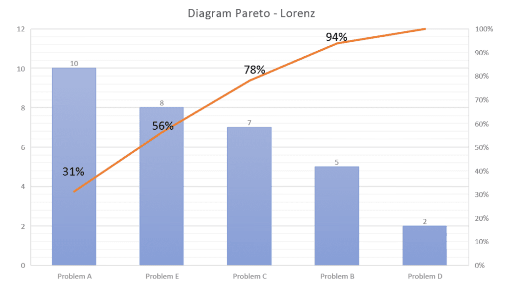
The bars will present in descending order, as shown in the figure above. Additionally, a Lorenz curve will generate, featuring a percentage scale on its right side. Contrary to the bars, this line will run incrementally, showing the percentage of individual observations.
The last cumulative percentage will always be 100%. Cumulative percentages indicate what percentage of all defects can be corrected when the most important types are resolved.
The graph shows that the first two categories account for 56% of the process problems. Therefore, if we want to achieve a significant reduction of the existing problems, it is enough to focus on eliminating the first two causes.
Examples of the Pareto diagram
Although primarily used in organizations, we must be aware that it also has many uses in private life. Below, we present a few examples:
- 80% of the company’s profits are related to 20% of the provided products or services
- 80% of wealth belongs to 20% of society
- 20% of efforts and workload achieve 80% of the results
- 20% of drivers cause 80% of accidents
Advantages of using the Pareto diagram
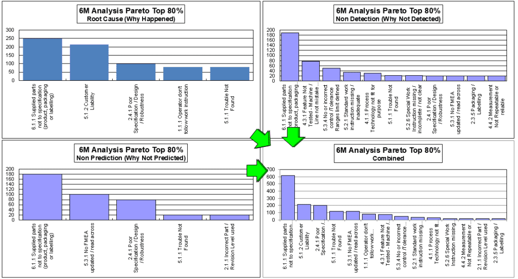
Combining the information contained in the Ishikawa diagram is a great accelerator for applying the Pareto diagram. This allows for the planning of systemic actions for recorded issues – see example below.
 The undoubted advantages of using the Pareto diagram include, above all, a simple form of data visualization (bars arranged in descending order), which translates into easier communication in teams dedicated to solving problems.
Additionally, it indicates what their priorities should be.
You can download an automatic, editable Excel form for free on the Free Quality Tools
Document name: Pareto Chart – Excel form
Author: Dariusz Kowalczyk